

Spring is a Good Thing
In which I remember that a good layout can change my whole mood.

Coming to you live from a bit of a chronic fatigue flare (it’s always something). So this week, we're introducing Lamp Posts - shorter, more frequent aesthetic memos straight from my brain to your inbox without ten rounds of editing.

Personally, I really need a pick-me-up, and my vintage magazine collection never lets me down. Today we're diving into an assortment of beautiful spring layouts from the April/May 1992 issue of Martha Stewart Living. No matter what the weather is where you are, these rich visuals are sure to transport you to an idyllic, sun-drenched East Coast spring.
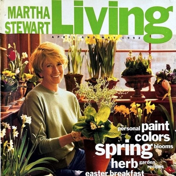
After flipping through this magazine at least fifty times, I'm already planning a deep dive into the magazine's art director, Gael Towey. (Spoiler alert: Towey’s website is a treasure trove of layout inspo from her 20+ year career at Martha Stewart Living.)
Last month, I mentioned that I was watching season one of Martha Stewart Living. I’m now halfway through season three and here’s what I’ve learned: the content of the show tends to mirror the magazine. Martha was a content distribution genius before most of us even knew what multi-channel meant. She was already doing what today’s social media “gurus” preach: say one thing, post it everywhere, tailor it to the platform.
I don't know why I find the lo-fi version of this strategy so fascinating? Maybe because we don't need to reinvent the wheel as much as we think we do?
Regardless, thanks to her flawless communication strategy, I am now an expert at forcing hyacinths, polishing silver, and trompe l'oeil furniture painting1. If only Martha taught personal finance...
If you need me, I'll be polishing my thrifted silver clamshell serving tray until it gleams with the false promise of control!
Grab a seasonal beverage, take a deep breath of spring air, and enjoy.
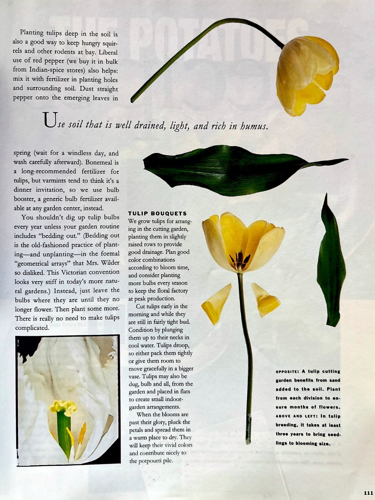
A tulip spread that should be in a museum2:
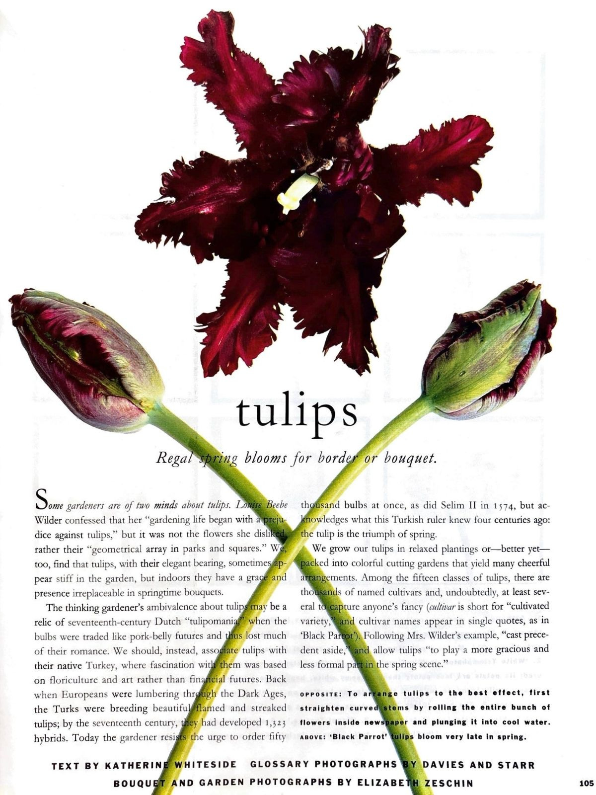
I’m sorry but that took my breath away.
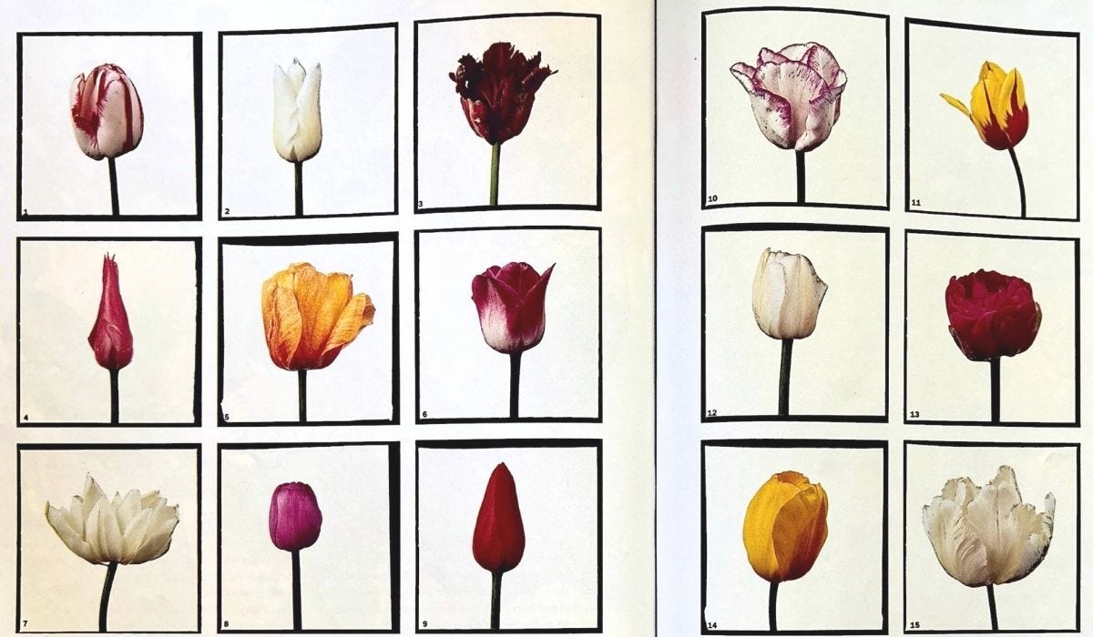
This reminds me of Stacy Greene’s lipstick portraits.
No notes.
I absolutely love this charmingly clunky layout. It’s light yet awkward and I can’t stop looking at it? It wouldn’t get an A in graphic design class and that is exactly why I love it.
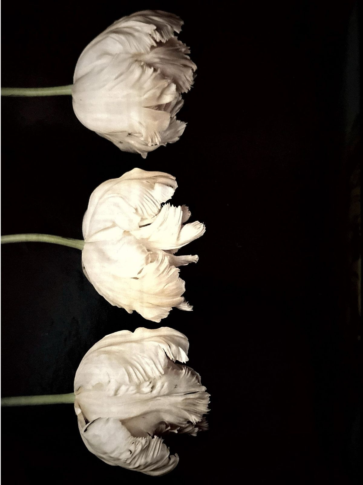
Everything else that caught my eye:


Maybe it’s that early 90’s optimism, but each image has that specific spring feeling you can somehow feel through the page. Light, hopeful, a little over the top. But per usual, Martha said it best in her Letter from the Editor:
“This is the setting in which to enjoy the company of friends and the tastes of spring’s delicate harvest.”
See you next time for another trip into the visual archive. Until then, treat yourself to something beautiful - you know you need it.
The magazine had rip out trompe l’oeil stencils that broke my brain and filled my crafter heart with joy.
Actually, Gael Towey’s work was exhibited in the Cooper Hewitt National Design Triennial Exhibition for product and packaging design in 2000.
THE TULIPS - loving these!!!! More Martha inspo please 🙏🏻🙏🏻🙏🏻 these spreads are amazing
Looooove! I guess tulips are my favorite flower now